10 Key Roles Charts and Graphs Play in Business Intelligence
Originally posted on https://www.boostlabs.com/business-intelligence-charts-and-graphs/
They say a picture is worth a thousand words.
When the currency you’re playing in is dollars, and your goal is to collect millions of them, you’ll need to learn how to create visuals.
Without a doubt, visuals and business intelligence systems go hand in hand more than ever. To find true success, you need to learn all that you can about data visualization and how it can be useful to you.
Consider the tips below to get started.
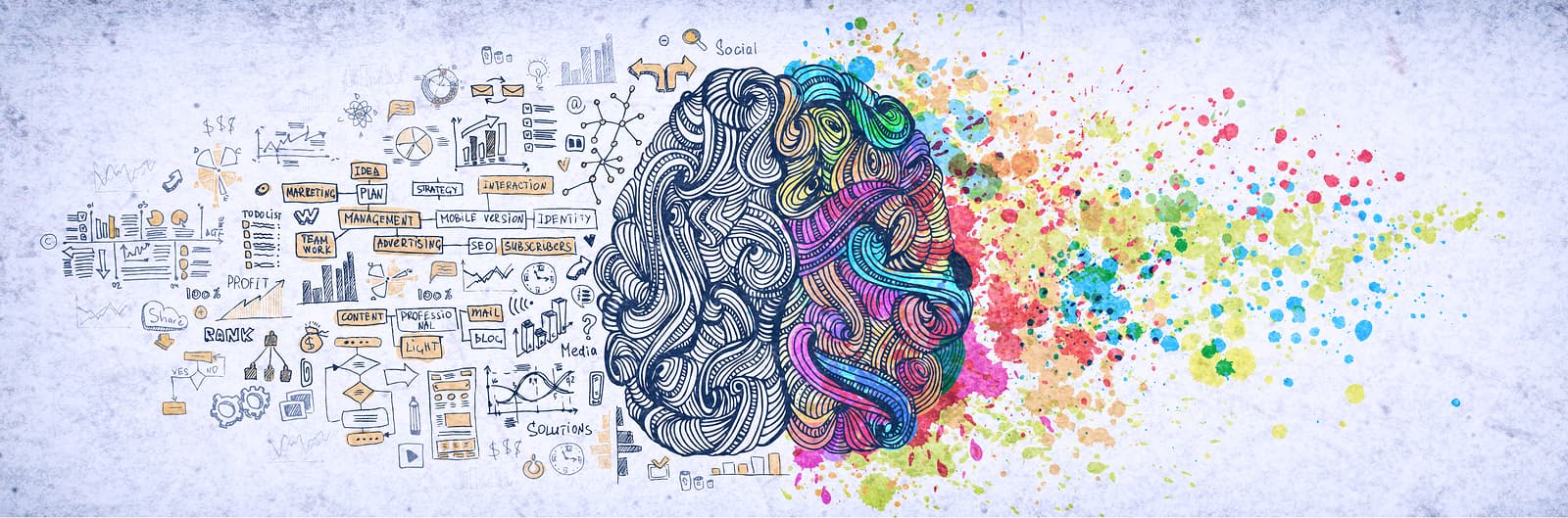
Why Business Intelligence Systems Need Visuals
Data visualization is your best friend when you’re trying to improve your business intelligence.
Studies show that in our society, we create close to 3 quintillion bytes of data each and every day. This amount of data is absolutely unfathomable to the brain, which is why it pays to create visuals.
When you make visuals, you are essentially sifting through this sea of data and creating bite-sized chunks of information that people can understand.
The following information will help you get a clear idea of how business intelligence works and why you need visuals.
1. Your Brain Processes Visuals Quickly and Efficiently

When you make use of data visualization, you’re playing to the strengths of the human brain.
Simply put, the importance of visuals for your data is pure science. A lot of studies have been created that back the effectiveness of visuals on the way our brains perceive them.
For instance, did you know that our brains process images 60,000 times quicker than text information?
In this regard, your data visualization is more than just a prop — it facilitates a more productive learning environment.
2. It Gives Clean, Easy to Understand Summarizes of Metrics

Keep in mind that it’s not just about creating data visualization, but more so how you utilize it.
Data visualization is useful because it summarizes and points out key metrics, such as sales revenue, customer retention, business productivity, profits and losses, overhead costs, and the size of your inventory.
When you hit these highlights, it cuts out a lot of the fluff and gets to the bottom line of importance. Since you only have so many hours in a day, it pays to create crystal clear understandings so that your business is time-effective and productive.
3. They Help to Point Out Problems and Market Trends

Without question, the most important thing that any business does is solve a problem. When you are no longer able to solve a problem, you are no longer to run a sustainable company.
With data visualization, you get a helping hand in pointing out market trends and existing problems, so that you are better able to solve them. When you are able to point out these problems, you and your team will have strong data that you can use as you put your heads together.
4. These Graphics are Effective for Presentations

Data visualization allows for creative storytelling that paints pictures in a person’s mind.
This provides the ultimate visual aide for any sort of presentation you are creating. Since business presentations often boil down to business won or lost, you can’t go wrong using some effective tools for clear business intelligence decision making.
In this regard, it’s important to get an understanding of the business intelligence data visualizations that are the most effective.
For instance, some companies tend to make use of 1/D Linear, 2/D planar or network, while others prefer 3/D volumetric or temporal. You’ll need to learn the attributes and purposes of each in order to make your presentations more effective.
With 1/D Linear, you are typically creating a simplified list of items or points, while 2/D planar involves map presentations across a specified geographical area. Examples of 2/D planar might include a map breaking down the political allegiance of voters, color-coded illustrations of temperature zones or elevation, and a neighborhood crime map.
Network data visualization models involve matrix plots, while 3/D volumetric maps are often high-tech computer simulations. Temporal data visualization breaks down timelines or other instances of time passing.
The better you master each data visualization type, the better the results you’ll get from it as a whole.
5. Complicated Doesn’t Work

The sky is the limit when you are able to keep things simple.
Right now, companies are wasting upwards of $40 billion a year on pointless, unfruitful meetings. A big reason that these meetings are unproductive is that they tend to be too complicated, without any actionable takeaways.
Rather than trying to show off your expertise in an overly complicated presentation, be a good steward over your expertise by explaining it in a way so simple that anyone could understand it.
Creating complicated data visualization models is counterproductive and won’t allow you to capitalize on business opportunities like you would hope.
Send your visualizations through several drafts until you are satisfied with both its simplicity and effectiveness.
6. Visuals Can Help Further and Continue Your Research

There’s a reason why some of the best entrepreneurs and CEOs use visual brainstorming techniques to come up with new, lucrative ideas.
Rather than serving as the end game of months of painstaking research, these visualizations instead act as a precursor to further understandings. By making the information real in the form of visualization, you will spark new ideas that will only be productive and helpful.
By having the information laid out plainly, people often gain insights that they didn’t have before.
7. They are Very Shareable

Today, more than ever, content is king, and you need to be producing high-quality content that is widely shareable.
After you have created a few data visualizations, you can share them widely across web platforms just as you would any other piece of information. This will help you further the discussion and bring lots of traffic to your ideas.
When you are trying to raise awareness of a certain part of your business, this visual content will be worth its weight in gold from a search engine optimization (SEO) standpoint.
By choosing to create something highly visual and shareable, you’ll improve your ranking and increase the chances of collaboration.
8. It Reduces the Margin of Error

Reducing the margin of error with any aspect of your business will prove incredibly helpful in the long run.
It allows you to see your ideas to fruition without setbacks in the process. By using data visualization, you are able to dissect each issue with a fine-toothed comb until you are crystal clear on it.
By getting a lot of your trial and error out of the way in the early stages, your time will be spent more productively and more cost-effective in the later stages. This is why so many companies today are spending money on the front end by hiring data analytics companies, rather than leaving themselves open to costly expenses later when correcting mistakes.
9. It Sets a Precedent That Helps Your Entire Company Get More Organized

If nothing else, data visualization gives your company the opportunity to set higher standards with the way you organize and present your information.
You will have the chance to give even the most minute piece of data the serious consideration it deserves. In this process, you are creating a precedent that will trickle down into other parts of your business.
You will start to take this level of care with all aspects of your company, making sure that there is always a need to simplify and clarify details.
10. It Helps You Solve Problems on the Fly

Though businesses are run on a set schedule, there are always matters you can’t foresee that need your attention. Data visualization gives you the power to address these situations as soon as they arise.
For example, you might get information about a competitor planning to sell or go out of business. With such a short window to work with, you will want to begin breaking down information to decide whether you want to throw your hat in the ring as a buyer.
With the right data visualization, you can quickly dissect the key metrics of the company and where yours is headed. This lets you work expediently toward a decision, and does so with less manpower needed.
Invest in the Best Visuals for Your Business Intelligence
As you can see, business intelligence systems and visuals go hand in hand. It is important that you not only understand why using these visuals are a must but how you can use them effectively so you can win big.
Boost Labs specializes in data visualization and reporting and would be happy to help you out.
Give us a call at (301) 560-7901, shoot us an e-mail at [email protected], or contact us online.