Creating the Best User Experience: 10 Facts You Need to Know About Responsive Sites
What do you know about responsive sites?
You heard that they’re a must in today’s mobile world. People are using their phones to access the information they need the moment they need it.
There’s no waiting to fire up a laptop or desktop computer to get the answers. Responsive sites are all about right here, right now.
Whether you have a responsive site or not, you’ll want to read on to learn the top interesting facts about responsive websites.
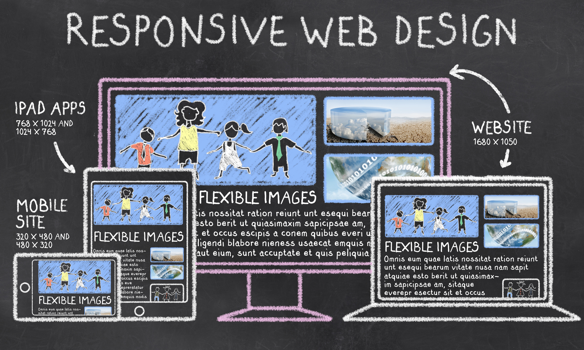
What Is a Responsive Website?
There’s a lot of confusion about what a responsive website is. The term responsive website is used interchangeably with terms like mobile-friendly or mobile sites. That’s sort of true, but there are several distinctions between these terms.
There are hundreds of different mobile devices that people will use to visit your website. There are iPads, iPhones, Amazon Fires, Samsung phones, Xiaomi, LG, and more all have slightly different screens and ways to access website content.
This can cause a nightmare scenario for developers. How can you create a website for so many devices? Enter responsive code. It’s HTML code that automatically adjusts to the user’s screen.
A mobile site is a separate website that’s built for mobile devices on a site’s subdomain. You’ll usually see this as “https://m.yourdomain.com.”
With a mobile site, it doesn’t automatically respond to the user’s screen the way that mobile code does. You often have to pinch your screen or manually expand it to make it usable.
10 Facts About Responsive Sites
Responsive sites are the future of the internet. If you’re not fully convinced of that, then take a look at these facts that are sure to change your mind.
1. Responsive Design Helps SEO
Do you wonder why your site doesn’t rank highly in search engines? If you don’t have a responsive website, you don’t need to wonder anymore.
Google switched to mobile-first indexing, meaning that it prioritizes crawling the mobile version of your site first. It will change its algorithm as searching habits change. As you’ll see, people are searching on mobile devices.
2. Users Expect a Fast Mobile Site
Not only do people expect your website to be responsive, but they also expect it to be fast. Users expect your site to load in about 2 seconds or less. If it doesn’t, they’ll go to another site.
3. People Buy on Mobile Devices
It’s easy to assume that people don’t make purchases on mobile devices. You might assume that they’ll find what they need on mobile and then go to a desktop to complete the purchase.
Think again. On Black Friday and Cyber Monday, mobile sales dominated purchases. They accounted for over $4 billion in sales and 68% of traffic.
That trend is only going to grow over time.
4. You’ll Lose Business if Your Website Is Subpar
That does seem a little harsh, but there’s a truth to it. If your site doesn’t function well or if it doesn’t look good to users, they will leave.
To make matters worse, 57% of people won’t recommend a business if they think the site is below standards.
With more people accessing content on mobile devices, if you’re giving them a bad user experience, they are unlikely to recommend your site to their friends.
5. People Will Research Products on Their Phones… In Your Store
You’d think that if someone is in your store, they’re doing all of the product research they need. You’d be wrong.
Customers will conduct product research while they’re shopping in your brick-and-mortar location.
They’ll look at reviews and other similar products before deciding to make a purchase.
6. Responsive Sites = Higher Conversion Rates
Brands have been able to increase their conversion rates by incorporating a responsive site design for mobile visitors.
Switching to responsive won’t guarantee a higher conversion rate. You’ll need to set up your website with a good offer that people would be interested in to drive conversions.
7. You Don’t Need to Create a Separate Mobile Site
Creating responsive sites is less expensive than creating separate mobile websites. With a responsive site, you only have to create one version of your site.
That will save a lot of money in development costs. If you want to know more about creating a responsive site, learn about this service.
8. People Will Visit Your Store After a Mobile Search
Here’s how people search for local services. They’ll look something up online, click through to a few websites, and then decide on one store to visit in person.
About 88% of people will visit a business within 24 hours of seeing that business in mobile search results. Remember, though, that if your website isn’t well-designed, users will skip your business altogether.
9. Responsive Sites Force You to Create a Better User Experience
Switching to a responsive site forces you to keep the user experience in mind. It’s an opportunity to look at your site from the user’s perspective and make your site better.
10. A Shockingly Small Amount of Businesses Have Responsive Websites
After seeing all of these statistics, you’d think that most sites would be responsive sites. That’s not the case at all. Only 17% of small business websites are mobile friendly.
With a number that low, you can capitalize on the trends and get your site to be a responsive one now. There’s a very good chance that you’ll be able to beat your competition.
Responsive Sites Are the Present and the Future
If you’re among the 83% of websites that are among those that don’t have a mobile friendly site, it’s time to get on the bandwagon.
Responsive sites are here and they’re here to stay. They help your business in so many ways. They create a better experience for your users, increase conversion rates, and they help with SEO.
If you don’t have a responsive website, your business will be left behind. To stay with the changing times, check out this article about SEO website design.