The Top 10 Types of Data Visualization Made Simple
Originally posted on https://www.boostlabs.com/10-types-of-data-visualization-tools/
Research shows that we create 2.5 quintillion bytes of data every single day. What types of data visualization do you use to properly digest all of that data?
While this is a staggering figure, it’s only going up as the Internet of Things (IoT) evolves. In fact, 90% of the world’s data was generated in the past two years alone!
With so much information accessible at our fingertips, it’s important to understand how to organize it into analyzable, actionable insights. Yet, if you manage multiple content assets with multiple data sources, it can be difficult to determine how to shape your analytics strategy.
This is where it helps to know the best data visualization types to use.
Data visualization is the process of turning your data into graphical representations that communicate logical relationships and lead to more informed decision-making.
Today, we’re sharing a list of the various types of data organization and how you can implement this approach in your own organization.
Ready to learn more? Let’s get started.
What is Data Visualization?
In short, data visualization is the representation of data in a graphical or pictorial format. It allows key decision-makers to see complex analytics in a visual layout, so they can identify new patterns or grasp challenging concepts.
From website metrics and sales team performance to marketing campaign results and product adoption rates, there is a range of data points your organization needs to track.
When you have your hands full juggling multiple projects at once, you need a quick and effective reporting method that allows you to get a clear point across. How do you know which types of data visualization method to use?
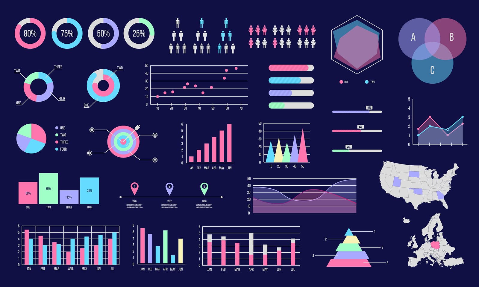
The 15 Most Common Types of Data Visualization Formats
Some of the most common types of data visualization formats include:
- Column Chart
- Bar Graph
- Stacked Bar Graph
- Stacked Column Chart
- Area Chart
- Dual Axis Chart
- Line Graph
- Mekko Chart
- Pie Chart
- Waterfall Chart
- Bubble Chart
- Scatter Plot Chart
- Bullet Graph
- Funnel Chart
- Heat Map
While all of them serve to expedite and improve data interpretation, not all are appropriate for the same job. Choosing the right visual aid is the key to preventing user confusion and making sure your analysis is accurate. Let’s dive into 10 of these 15 types of charts and graphs below.
10 Types of Data Visualization Explained
There are myriad different types of charts, graphs and other visualization techniques that can help analysts represent and relay important data. Let’s take a look at 10 of the most common ones:

1. Column Chart
This is one of the most common types of data visualization tools. There’s a reason we learn how to make column charts in elementary school. They’re a simple, time-honored way to show a comparison among different sets of data. You can also use a column chart to track data sets over time.
A column chart will include data labels along the horizontal (X) axis with measured metrics or values presented on the vertical (Y) axis, also known as the left side of the chart. The Y-axis will normally start at 0 and go as high as the largest measurement you’re tracking.
You can use column charts to track monthly sales figures, revenue per landing page, or similar measurements. Consistent colors help keep the focus on the data itself, though you can introduce accent colors to emphasize important data points or to track changes over time.

2. Bar Graph
You can often use a bar graph and column chart in the same way, though column charts limit your label and comparison space. It’s best to stick with a bar graph if you’re:
- Working with lengthier labels
- Displaying negative numbers
- Comparing 10 or more items
In this case, your data labels will go along the Y-axis while the measurements are along the X-axis.

3. Stacked Bar Graph
Are you comparing many different items? Do you want to track the individual growth of each data set itself, along with the group’s growth as a collective whole? To reveal this part-to-whole relationship, you’ll create a stacked bar graph.
If you removed the color from this chart, it would look similar to a standard bar chart. The “stacked” layout represents this chart’s contrasting color scheme. These colors map back to a legend that accompanies your map.
For example, you might want to track the performance of four different types of products across five different sales strategies. Strategy 1 through Strategy 5 will be at your X-axis, while sales numbers will be on the Y-axis.
Within each strategy category, however, you’ll have four different color blocks. Each represents one of the product types. This way, you can determine which strategy worked best for each product type as a whole, as well as which products did well within each strategy.

4. Line Graph
This is another one of those standard chart types that’s instantly recognizable. A line graph is designed to reveal trends, progress, or changes that occur over time. As such, it works best when your data set is continuous rather than full of starts and stops.
Like a column chart, data labels on a line graph are on the X-axis while measurements are on the Y-axis.
Make sure to use solid lines and avoid plotting more than four lines, as anything above this can be distracting. You should plan enough space that your lines are around 2/3 the height of the Y-axis.

5. Dual-Axis Chart
While most visualization charts use a single Y-axis and X-axis, a dual-axis chart incorporates a shared X-axis and two separate Y-axes. Most combine the features of a column chart and a line chart, though you can vary the graphing styles according to the data you’re using.
This layout allows you to show a relationship (or lack thereof) between different variables, and it works best when you’re working with three data sets as follows:
- One set of continuous data
- Two data sets grouped by category
As our brains are more inclined to read from left to right, it helps to make the left-side Y-axis the primary variable. It’s also important to use contrasting colors for the two charts to provide visual distinction.

6. Mekko Chart
This is one chart you might be less familiar with unless you’re in the data analyzation space. Standing for Marimekko chart, a Mekko chart has a similar layout to a stacked bar graph, with one major exception: Instead of tracking time progression, the X-axis measures another dimension of your data sets.
With this layout, you can compare values, measure the composition of each value, and analyze data distribution all at the same time.

7. Pie Chart
A pie chart represents one static number, divided into categories that constitute its individual portions. When you use one, you’ll represent numerical amounts in percentages. When you sum up all of the separate portions, they should add up to 100%.
These are especially helpful in digital marketing, as you can use them to show a breakdown of:
- Market shares
- Marketing expenditures
- Customer demographics
- Customer device usage (for UX testing)
- Online traffic sources
You want your pie chart to have plenty of differentiation between slices. As such, it’s best to limit the number of categories you illustrate.

8. Scatter Plot
This type of visualization is also called a scattergram, and it represents different variables plotted along two axes. Note that both the X-axis and the Y-axis are value axes as a scatter plot does not use a category axis.
These types of data visualization work best when you’re analyzing multiple data points and you’re looking for any similarities within the data set. As you do so, you can notice any outliers and also gain a clearer understanding of your overall data distribution.
Say, for instance, that you wanted to measure customer feedback scores that your organization receives. You also wanted to see if your service desk response times have any impact on those scores.
Feedback scores range from 0 to 10, so those would be your Y-axis measurements.
On your X-axis, you’d label from 0 until the longest response time allowed, such as one hour. Then, you’d plot the scores you’d received, noticing patterns and trends that can help inform your service efforts.

9. Bubble Chart
Like a scatter chart, a bubble chart can also show relationships or distribution.
In this variation, however, you’ll replace the data points with bubbles. You’ll also vary the sizes of the bubble to represent a third data set.
As with a scatter chart, a bubble chart does not use a category axis. Rather, you’ll plot the data sets as X-values, Y-values and now, Z-values (bubble size).

10. Bullet Graph
Is your team working toward a goal? A bullet graph can help you visually track your progress. Similar in layout to a bar graph, these also incorporate other visual elements.
When using a bullet graph, you’ll begin with a one, main measure, and then compare that measure to another (or multiple) measure to find a deeper meaning and connection.
Five Essential Reasons to Implement Data Visualization Tools
Now that we’ve explored the different types of data visualization graphs, charts, and maps, let’s briefly discuss a few of the reasons why you might require data visualization in the first place.
If you’re on the fence about which type of visual will work best for your company, it helps to understand the top business functions that data visualization can serve. Here are the main five to consider.
1. Comparing Values
As data analysts, you see your fair share of data sets. When you want to compare the differences and similarities between these sets, charts are ideal. They easily reveal the high and low values of a particular set so you can note major differences, gaps, and other trends.
If you need to create a comparison chart, the following types of visualizations are appropriate:
- Column Chart
- Bullet Graph
- Mekko Chart
- Pie Chart
- Bar Graph
- Line Graph
- Scatter Plot
Any of these visualization techniques allow you to scan through huge amounts of data and still derive relevant and informative patterns from it.
2. Show Composition
You might also need to break your value sets apart, showing how individual units affect the greater picture. For instance, you may want to track overall mobile access on your website by device type or geographical location. Or, you might want to know which elements of your recent digital marketing campaign proved the most successful.
In this case, you can use any one of these types of data visualizations:
- Pie Chart
- Stacked Bar Graph
- Mekko Chart
- Stacked Column Chart
- Area Chart
- Waterfall Chart
All of these representations allow users to measure individual performance levels to determine their effect on the overall data set.
3. Determine Distribution
Are you trying to understand the overarching distribution of your data? If so, a distribution chart will show all of the possible intervals or values of the value set as well as how often they occur.
From this visualization, you can identify the normal trends as well as any outliers that could disrupt them. You can also get a clear picture of how wide the range is between your information values.
You can reach for the following types of data visualizations when you need to determine distribution:
- Scatter Plot
- Mekko Chart
- Line Graph
- Column Chart
- Bar Chart
4. Researching Trends
Did you wrap up a recent television advertising campaign? What about a new product launch?
Once the dust settles and it’s time to get back to work, it’s your job to see if those efforts succeeded. When you want to determine how a particular data set performed during a set time frame, these types of visualizations work well:
- Line Graph
- Dual-Axis Line Graph
- Column Chart
5. Understanding Relationships in Different Types of Data Visualization
Sometimes, the best way to understand a given variable is to see how it relates to one or multiple other variables. For instance, one variable could have a positive or negative effect on another.
You can use these types of charts to visually depict the relationship between things:
- Scatter Plot
- Bubble Chart
- Line Graph
Partner With the Best Data Visualization Services
Are you ready to make sense of all of the data that your organization receives? If so, you can’t get there by relying on antiquated analytics or clunky spreadsheets. It’s time to look into various types of data visualization.
Instead, it’s time to partner with the best data visualization services around. We’re a full-stack data visualization and software products firm, ready to help you communicate complex data with ease to every member of your organization.
See how we can build data visualization charts to help your company grow and Check out our portfolio. Already know our services are a match for you or want to see a demo? Contact us today to learn more about how we can help your business leaders see more clearly, starting today!